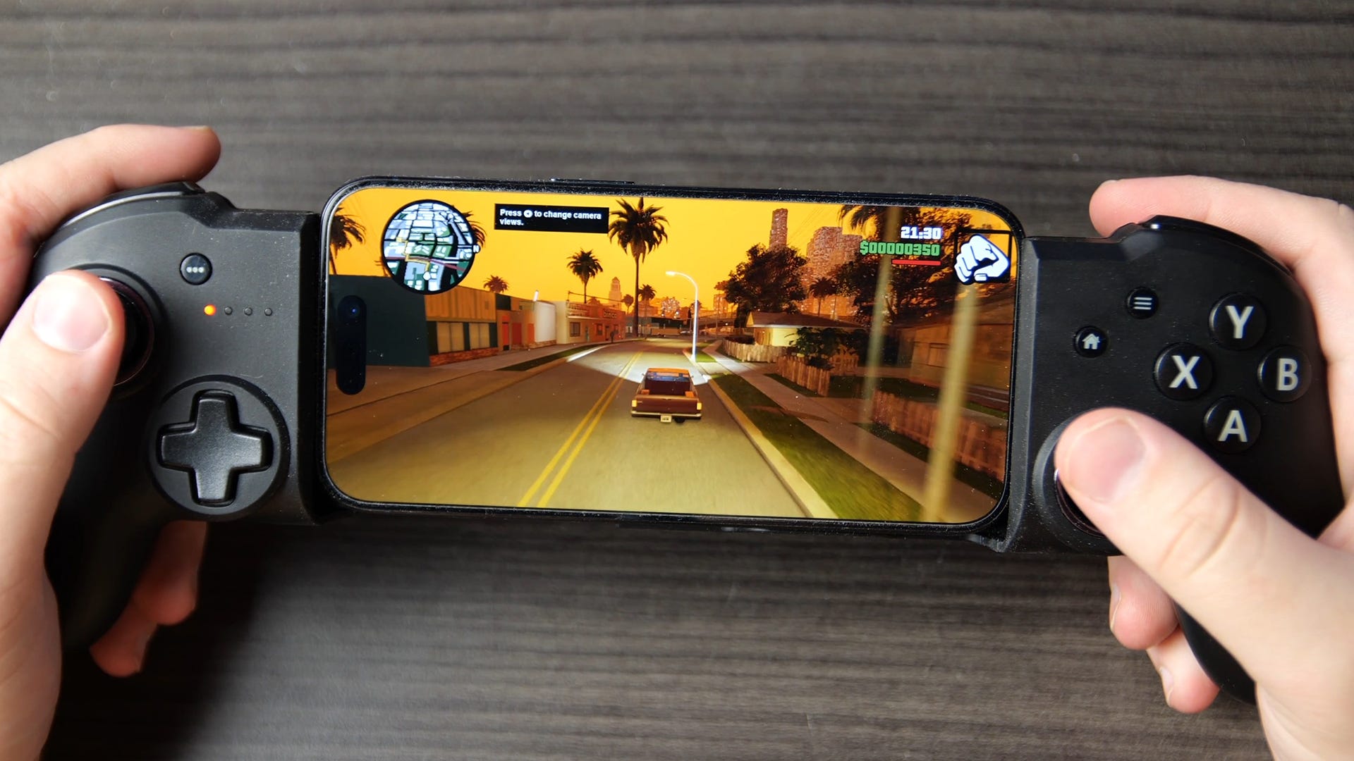
Grand Theft Auto: The Trilogy - The Definitive Edition tested on iPhone

The Grand Theft Auto Definitive Edition remasters were highly controversial and to this day, their quality remains contentious. These Unreal Engine 4-powered game updates modernised the three classic PS2-era GTA games - GTA 3, Vice City and San Andreas - with much more advanced rendering technology. At the same time, the reworked lighting was very different from the original titles and the updated assets didn't hold up to close scrutiny. Some two years later, these titles have been released for mobile devices, with versions for iPhone, iPad, and Android. These promise the same updated graphics, paired with considerable lighting improvements. So how do modern iPhone and iPad devices cope with these divisive remasters and do the new lighting effects rehabilitate their visual designs?
The GTA Definitive Edition titles adopt a very different visual tone from the original games. San Andreas was the most severely affected, lacking the sepia-toned haze that defined the original release. GTA 3 lost its blue and green tint, and Vice City had a pretty neutral look. Basically, all three titles look bland when measured up against their PS2 forebears, which had distinctive visual styles. Looking at the iOS version of the game it's clear that the lighting has been dramatically overhauled to bring it more into line with the original games. During gameplay, distant detail is occluded somewhat by a sort of blueish distance fog, giving the game a hazy and slightly oppressive feel.
If we go back to PS2, this kind of fog effect served a dual purpose, obscuring pop-in on the relatively weak hardware, and providing a sense of atmospheric scattering, so its replication on iPhone doesn't need to occlude as much distant detail. As the day fades away, this effect takes on a hazy, orange look, as the sun's rays travel through a thicker layer of atmosphere.
Nguồn: Eurogamer